
Porfolio Case Study
How We Increased Superbra's Mobile Conversion Rate by 1,5%
Optimizing the mobile shopping experience for an 7-figure lingerie brand through strategic PDP improvements and data-driven design decisions.
1.5%
Conversion Rate Lift
33%
Revenue increase
7K+
Monthly Revenue impact
7 Fig
Brand Size
The Challenge
Superbra, a leading 7-figure lingerie brand with multiple stores across the Netherlands, was experiencing suboptimal mobile conversion rates on their product detail pages.
The Solution
A comprehensive CRO sprint focused on optimizing the mobile PDP experience through five strategic improvements designed to maximize above-the-fold conversion elements.
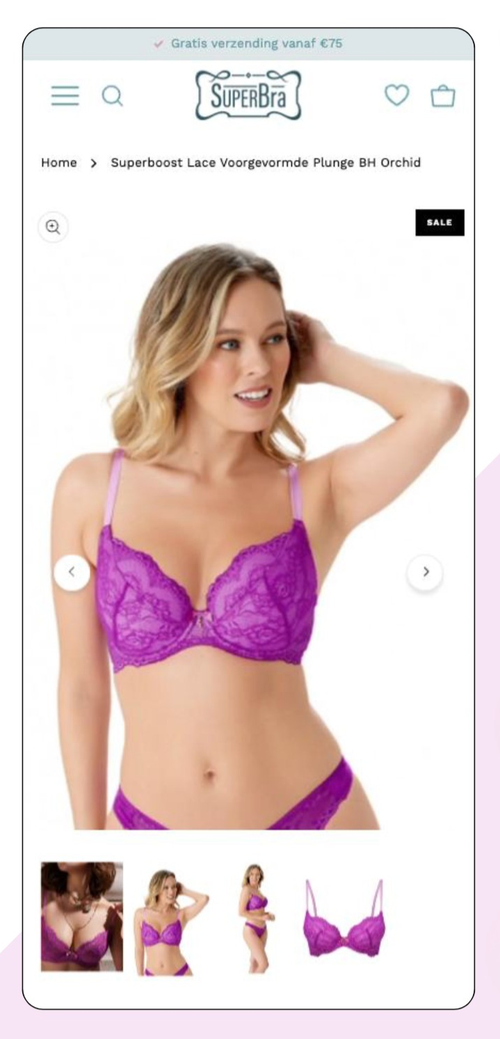
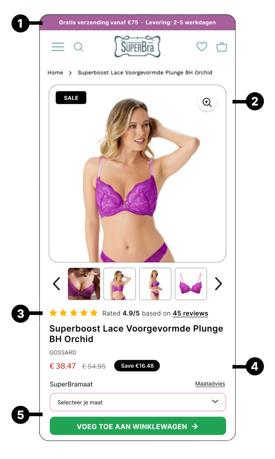
Visual Transformation
See how strategic design changes transformed the mobile PDP, bringing critical conversion elements above the fold.
BEFORE
AFTER
The Results
Data-driven improvements that delivered measurable impact across key performance metrics.
ROI Analysis
Understanding the business impact of conversion rate optimization at scale.
Key Takeaways
Lessons learned from optimizing mobile shopping for an 8-figure brand.
